How to connect EditorJS in Admiral

Hi! We're dev.family or family of developers. It doesn't mean that we're all blood kin, but we are all united by the love of cool projects, complex and interesting tasks and technologies.
dev.family is outsourcing company with a huge background and team of 30 wonderful peolple.
We are focused on Custom Web & Mobile. Our main focus: e-commerce & food tech.
Our capabilities range from product strategy, product design & development, and ongoing product maintenance services.
Hi everyone, just a reminder that we are developing Admiral - an open source solution on React, which allows you to quickly develop beautiful CRUDs in admin panels, but create fully custom interfaces if you want. From developers for developers with love, as the saying goes.

Today, using Editor JS as an example, we will show how to easily and quickly connect an editor to a project created in Admiral. This is a block editor with universal JSON output, the parsing of which is easy to customize to your taste. By default, Editor JS looks quite limited, but its trick is to easily expand its functionality using plugins that you can write yourself. Officially supported plugins are here.
• Watch the live demonstration on the official website.
• A demo of the entire process, which I will describe below, can be viewed here.
Let’s go.

Required Dependencies
We install the editor itself and several plugins:
@editorjs/editorjs@editorjs/header@editorjs/image@editorjs/paragraph
Typing
If you use TS in a project, you will need to set a type description for each plugin, but not all of them exist.
The typing packages are named @types/editorjs__image and are installed with yarn add -D @types/editorjs__image or npm i -D @types/editorjs__image
If there is no package with typing, or you are simply too lazy to install additional packages, you must manually declare the package. To do this, create a global.d.ts file in the project root with the following content:
declare module '@editorjs/header'
declare module '@editorjs/image'
declare module '@editorjs/paragraph'
Integration into a project with Admiral
All that remains is to add admiral-adapted components with Editor JS integration.
The file structure of the component looks like this:
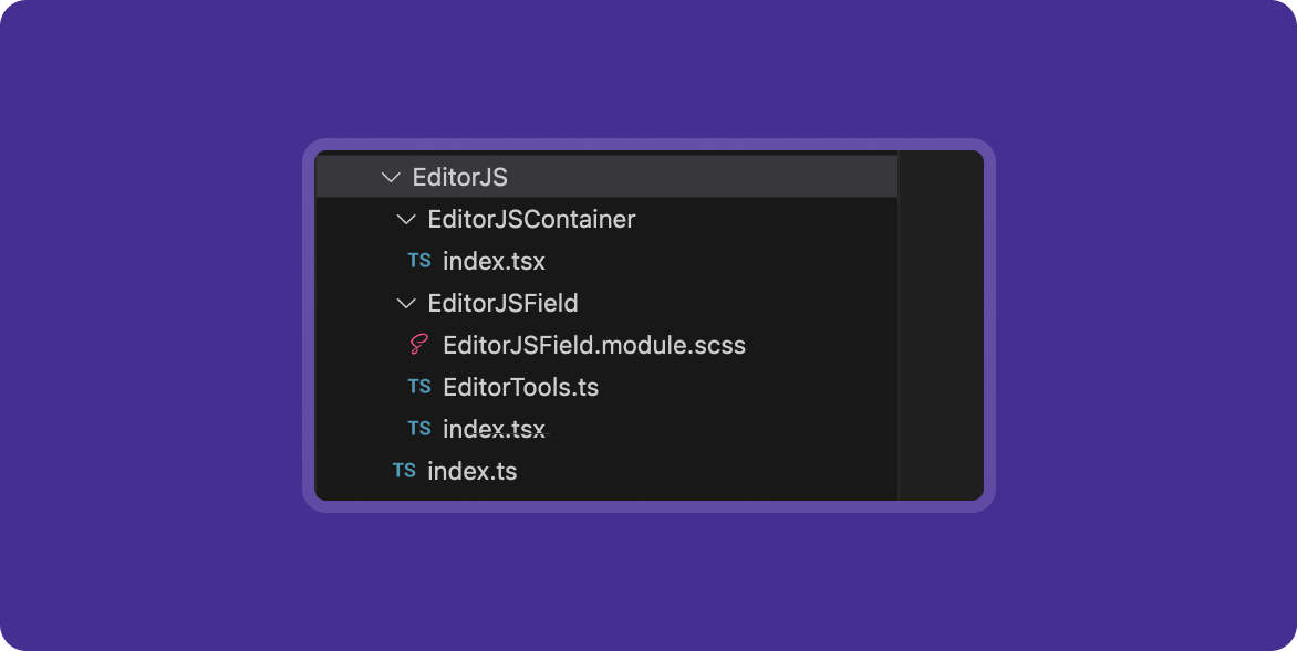
A container above the editor itself for interacting with the useForm() hook, which we use inside Admiral – EditorJSContainer:
import React, { memo, useCallback } from 'react'
import EditorJS, { EditorConfig, OutputData } from '@editorjs/editorjs'
import { Form, FormItemProps, useForm } from '@devfamily/admiral'
import '@/assets/editor.scss'
import EditorJSInput from '../EditorJSField'
type UploadResponseFormat = { success: 1 | 0; file: { url: string } }
interface EditorProps extends Omit<EditorConfig, 'onChange' | 'holder'> {
    isFetching: boolean
    value: OutputData
    holder?: string
    imageUploadUrl?: string
    imageUploadField?: string
    onImageUpload?: (file: Blob) => Promise<UploadResponseFormat>
    onChange: (value: OutputData) => void
}
type Props = Partial<Omit<EditorProps, 'value'>> & FormItemProps & { name: string }
function EditorJSContainer({ name, label, required, columnSpan, ...rest }: Props) {
    const { values, errors, isFetching, setValues } = useForm()
    const value = values[name]
    const error = errors[name]?.[0]
    const onChange = (value: OutputData) => {
        setValues((values) => ({ ...values, [name]: value }))
    }
    // prevent reopen when close picker by clicking on label
    const onLabelClick = useCallback((e) => {
        e?.preventDefault()
    }, [])
    return (
        <Form.Item
            label={label}
            required={required}
            error={error}
            columnSpan={columnSpan}
            onLabelClick={onLabelClick}
        >
            <EditorJSInput value={value} onChange={onChange} isFetching={isFetching} {...rest} />
        </Form.Item>
    )
}
export default memo(EditorJSContainer)
The component within which the editor itself is initialized and configured – EditorJSField.
import React, { memo, useCallback, useEffect, useRef } from 'react'
import EditorJS, { EditorConfig, OutputData } from '@editorjs/editorjs'
import { Form, FormItemProps, useForm } from '@devfamily/admiral'
import styles from './editorJsInput.module.scss'
import '@/assets/editor.scss'
import { EDITOR_TOOLS } from './EditorTools'
const defaultHolder = 'editorjs-container'
type UploadResponseFormat = { success: 1 | 0; file: { url: string } }
interface EditorProps extends Omit<EditorConfig, 'onChange' | 'holder'> {
    isFetching: boolean
    value: OutputData
    onChange: (value: OutputData) => void
    onImageUpload?: (file: Blob) => Promise<UploadResponseFormat>
    holder?: string
    imageUploadUrl?: string
    imageUploadField?: string
}
function EditorJSField({
    isFetching,
    value,
    holder = defaultHolder,
    minHeight = 300,
    onChange,
    imageUploadUrl,
    imageUploadField,
    onImageUpload,
    tools,
    ...rest
}: EditorProps) {
    const ref = useRef<EditorJS | null>(null)
    useEffect(() => {
        if (!ref.current && !isFetching) {
            const editor = new EditorJS({
                holder,
                tools: tools ?? {
                    ...EDITOR_TOOLS,
                    image: {
                        ...EDITOR_TOOLS.image,
                        config: {
                            endpoints: {
                                byFile: imageUploadUrl,
                            },
                            field: imageUploadField,
                            uploader: {
                                uploadByFile: onImageUpload,
                            },
                        },
                    },
                },
                data: value,
                minHeight,
                async onChange(api) {
                    const data = await api.saver.save()
                    onChange(data)
                },
                ...rest,
            })
            ref.current = editor
        }
        return () => {
            ref.current?.destroy()
            ref.current = null
        }
    }, [isFetching])
    return (
        <section className={styles.section}>
            <div id={holder} />
        </section>
    )
}
export default EditorJSField
Styles can be created if necessary at your own discretion.
Using the component looks like this:
<EditorJSInput
       required
       imageUploadUrl={apiUrl + '/editor-upload'}
       label="Контент"
       columnSpan={2}
       name="content"
/>
At this stage, the integration of the editor into the admin panel is complete.
Processing final data on the client side
Now it remains to figure out how to process the data received from the editor. The final data has the following structure:
{
   "time": 1550476186479,
   "blocks": [
      {
         "id": "oUq2g_tl8y",
         "type": "header",
         "data": {
            "text": "Editor.js",
            "level": 2
         }
      },
      {
         "id": "zbGZFPM-iI",
         "type": "paragraph",
         "data": {
            "text": "Hey. Meet the new Editor.."
         }
      },
      {
         "id": "XV87kJS_H1",
         "type": "list",
         "data": {
            "style": "unordered",
            "items": [
               "It is a block-styled editor",
               "It returns clean data output in JSON",
               "Designed to be extendable and pluggable with a simple API"
            ]
         }
      },
   ],
   "version": "2.8.1"
}
You can parse data at your own discretion. We are using the html-react-parser library. Here's what the component looks like then (in its simplest form):
import parse from 'html-react-parser';
import styles from './EditorJSParser.module.scss';

type TBlock = { id: string; type: string; data: T };
export type EditorJSData = {
  blocks: TBlock[];
  time: string;
  version: string;
};
type EditorJsProps = { data: EditorJSData };
const EditorJsParser = ({ data }: EditorJsProps) => {
  return <div className={styles.content}>{parse(data)}</div>;
};
export default EditorJsParser;
Application of the component:
<EditorJsParser data={editorData} />
In the SCSS/CSS file you can set any styles that will be applied to the final html.
Let's sum it up
Once you install all the necessary dependencies and add a few simple components to your project, you can easily connect a modern editor to your application and enjoy all its benefits. Set any styles, connect available plugins and expand functionality. You can also write your own plugins and contribute to the development of an outsourced product - try it, it’s nice :)